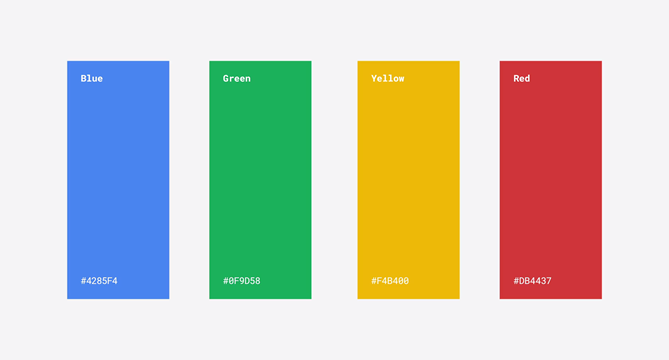
Google has been leading the market for some time now and the visual market niche is no exception. Through simple, functional design and by using bright colors they managed to develop a unified system which connects with a field that is constantly changing and adjusting.
In this article, we present a useful collection of five essential websites for any designer that intends to approach to the Google world!
MATERIAL DESIGN
Through Material Design Google provides many resources with its own distinctive visual language aiming to connect design basic principles and technology innovation, unifying diverse platform experiences while focusing on a natural and fresh design for applications.
In each of its sections the website has a series of explanations and advice to be taken into account when designing. Through examples and their own experience, they mean to show designers and developers which is for them the best way to design in an efficient and functional manner.
This library contains everything from colors, shapes, contrasts, icons, shadows, physical characteristics of element to animations and transitions… A whole series of resources and artifices that help you design or develop under these criteria.
MATERIAL UP
In Material Up we can see an open board in which one finds shared work developed using “Material Design”. It is a social network in which designers and developers can share, discuss and show works created in the Google system. It is definitely a great source of inspiration for those working in a project that requires this kind of graphic and design concept.
MATERIAL PALETTE
Material Palette functionality resides in its easy-to-use color combination tool. You just have to select two colors with which you want to work (a primary and a secondary color) and it will show a color palette made out of these two and also where to apply it based on guides suggested in Material Design.
It also allows you to save this palette in various formats (CSS, SVG, XML, PNG…) We can infer that this graphic trend banks on the concept of a main color and its different shadows, a secondary color to tinge and establish hierarchies and a combination of grey shadows for the rest of the components and depths.
MATERIALIZE CSS and MATERIAL DESIGN LITE
Thanks to Materialize CSS and Material Design Lite developers are able to gather resources and understand the logic behind interaction and reaction of elements. In addition, there are several tutorials about development and usability for mobiles which implies a bonus to bring oneself up to date and be able to adapt to the inertia of the digital market.
Other features to take into account are animations and usability. One of the challenges to face was to provide an organic user experience in which elements can interact and respond in a natural manner. There are several tutorials that address this subject.
CONCLUSION AND DISCUSSION
On one side, there are many people who think that Material Design is a great initiative by which Google is able to extend their style, logics and their vision about digital communications and technology.
However, and here comes the discussion, there may be some who see it as a unilateral and authoritarian way for the color-lettered giant to impose their ways, which might level down graphic criteria and therefore, minimize the importance of graphic arts and development as a synergy made up by different perspectives.


