You've surely heard the phrases "responsive design" and "mobile first" tossed around. From some years back the web is putting more emphasis on good user experience. In fact, that's the main reason why businesses are concerned with investing in web design: if the usability of a site is low, you can bet the user rate follows suit.
Historically, web designers and their clients have approached the desktop side of any project first, while leaving the mobile part as a secondary goal, but there’s a growing trend though to flip this workflow on its head and actually begin with mobile considerations and then work up to a larger version.
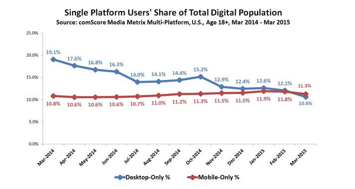
Mobile isn’t a trend it’s the present. Just for consideration, for the first time in March, the number of mobile-only adult Internet users exceeded the number of desktop-only Internet users, in the U.S.

Source: comScore
However, the fact that mobile web access is popular does almost nothing to convince me that I need to pursue a strategy that actually puts mobile first. Obviously, the desktop is still an important platform.
Graceful Degradation and Progressive Enhancement: an overview
Graceful degradation occurred out of a necessity to have a design function in as many browsers and platforms as possible. In the practice, developers and designers build web functionality so it provides a good level of user experience in more browsers. The general conclusion was to create and serve up the best experience achievable, and then account for each possible degradation and ensure that despite any shortcomings, the site would remain functional. When it comes to mobile website design, this meant that a full, standard website would scale back and gradually eliminate features and content.
Out of this trend arose a powerful new idea: progressive enhancement: a similar concept, but in reverse. In this version of the tale, the web site or application would establish a base-level of user experience for most browsers. As the need arises, the site can gradually be “enhanced” and even completely rethought for larger platforms with fewer constraints.
In short, graceful degradation starts from the complexity and tries to fix for the lesser experience: start big and then reduce, whereas progressive enhancement starts from a very basic, working example and allows for constant extension for future environments. With a mobile first viewpoint, we start by loading the absolute bare essentials on the smaller platforms. This leads to a snappier experience that avoids unnecessary lags.

Being responsive. Living Mobile
Mobile first and responsive web design are huge buzz words in the web design world.
If you’re reading this on a desktop, grab the right edge of the browser and start shrinking it. See the way the content has shifted itself around? That’s responsive design: different elements of the page should be able to change when viewing them on a smaller screen.
Desktop browsers can do amazing things, but what looks fantastic on a desktop can look horrendous on a tablet or smartphone. Planning your site layout is different for mobile than it is for a desktop, because you’re forcing yourself to identify what’s important about your content to your user.
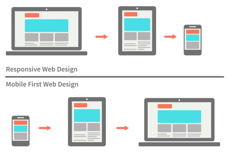
The term mobile first already gives us a good hint of what to expect: primarily focusing on development for mobile devices. The common responsive approach works with the desktop browser as the basis, and offers alternative, scaled down versions for other device sizes.
Conceptually starting with displaying a website on mobile devices, rather than on a desktop, leads to a quite different approach on how to deal with content. Mobile first means content first and makes you really think about specific design decisions. For example, if you want the different versions of your site to resemble each other, you’ll have to pick a font for your headers that looks great on the smallest device.
At first glance, these two methodologies seem roughly equivalent. Is not exactly like that, but the good news is that these two approaches aren’t competitive. To choose one or the other depends on the needs of each kind of project.


